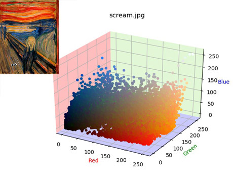
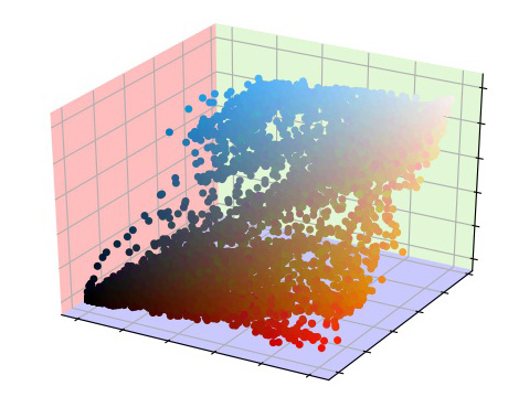
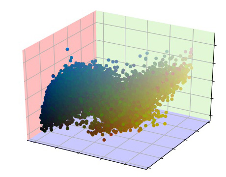
I found some beautiful scatter plots of famous art and took it as a challenge to recreate them! I naturally turned to Matplotlib to graph the colors as 3D Positions. Each colored plane shows which color increases when you move away from the plane, e.g when a point moves up, away from the blue plane, the point becomes more blue.

Usage: I used Python’s ArgumentParser to make my tool easier to use. An example use:
python PlotImage.py *.jpg --points 20000 --pprint
This plots all Jpeg images using at most 20,000 points from the image. It pretty-prints the plot by removing axis labels, titles, and doesn’t draw the original image. It also uses other optional flags such as –save to save the plotted images and –nodisplay, which runs the program without drawing to the screen.
Here’s an example without pretty-print turned on: